The devices and browsers are increasing day by day that need to work with your website. It’s not enough to just have a mobile version and a browser version and we really can’t create each version for iPad, iPhone, Android mobiles, tablets, television, netbooks, desktops with high and low resolution screens. Our website design should not only be more flexible, but more adaptive to the media that renders them.
Designers should create designs that adjust to the needs of each browser regardless of the device. The time is to think how we can make web design process which work for decade and it’s possible only with Responsive Web Design. Lets take a look in key feature element of Responsive Websites.
Key Elements of Responsive Web Design
- Flexible Layouts
- Flexible Images
- Media Queries
Flexible Layouts:
First step considered for responsive design is flexiable layout. As the browser width changes, fluid grids will resize and resposition the content as necessary. Tiny Fluid Grid is a great tool for creating flood grids and you must try. This tool allow you to make grids up to 1200px maximum width.
Flexible Images:
Adjusting images according to the different screen widths or devices is another important aspect of responsive web design and there are a couple of ways you can acheive this. Completely resize the image on the flyDynamically crop the imageCombine bot methods so the image resize at certain size, the image just shrinks and it get croped when it get below specific size.
Media Queries:
In CSS2 you was able to apply specific stylesheet for specifc media type like screen or print. In CSS3, W3C made it more efficient by adding media queries made it as part of the CSS3 specification. It is the most excisting feature of responsive web design. Media Queries behave similar to conditional comments. For example, you have one stylesheet for large screen or display and different stylesheet for mobile devices with specfic width’s. Media queries allow designers to create multiple layouts using the same content.
Here are some examples of media queries that serve a stylesheet depending on the width of the viewport:
Max Width:
The following code will apply if the max-device-width is 320px.
<link rel="stylesheet" media="(max-device-width: 320px)" href="mobile.css" />
Min Width:
The following stylesheet will apply if the viewing area is greater than 1200px.
<link rel="stylesheet" media="(min-width: 1200px)" href="largescreen.css" />
Multiple Media Queries:
You can use multiple media queries. The following stylesheet with apply if the viewing area is between 700px and 1000px
<link rel="stylesheet" media="(min-width: 700px) and (max-width: 1000px)" href="normalscreen.css" />
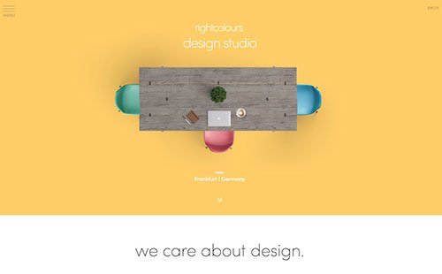
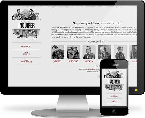
Responsive Websites
Let’s explore some beautiful and creative examples of Responsive Web Design and the magic behind media queries.

Hicks Design

Think Vitamin

Responsive Web Design (Example page from A List Apart)
Art Equals Work

8 Faces

Information Architects

Tee Gallery

Andersson-Wise

Zedd Mobile

Upper Dog

Cohenspire

Robot or Not

Glitch

Sweet Hat Club

Other Useful Resources:
We hope you enjoyed this post about responsive web design. If you have something to say about responsive design, drop us a comment. If you got more examples of responsive web design you would like to share with us, do it in the comments below or write us from the contact page.
About The Author