First impressions of any company or individual is must, especially for big brands. When someone is introduced to a company, she/he will conclude a quick judgement about your brand. The design of the brand gives the judgment about your business. For this purpose creating an elegant and attractive logo and business card is very important. In today’s modern world, you can create elegant and creative designs for your brand name which leave potential customers to recognize your company immediately.
There’s a confusion between people about word brand. It’s much more than a name or logo. It is the mixture of all the capabilities and impressions of a concern which includes the vendors, public relations, vendors, customers and the communities. Your brand is the feeling/image that a customer gets when introduced.
It is very important to focus on the design of the Brand name which should be straight forward about its products/services, short and attractive. To make things easier and understand, we collected inspiring branding & corporate identity designs for inspiration. The success of Brand designing depends on good combination of the color, style or visual appearance , topography, intensity and the size. Appropriate usage of these elements will provide uniqueness to your brand.
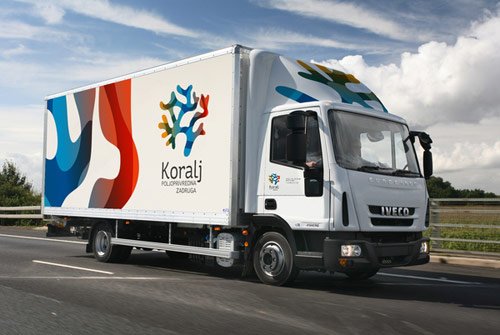
Koralj Identity
The main idea behind this identity is “overlapping” which can be found in many places related to commercial fishing but also corals themselves which when overlapped sometimes create intriguing shapes. The colors are inspired by sun rays traveling through the sea but also by fishes and fishing equipment. You will see multiple variants of business card, memos, etc. in order to reflect the turbulent nature of the sea.

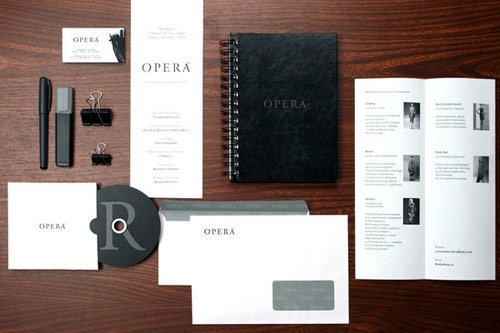
Opera
Identity and branding design for multibrand boutique.
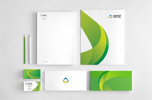
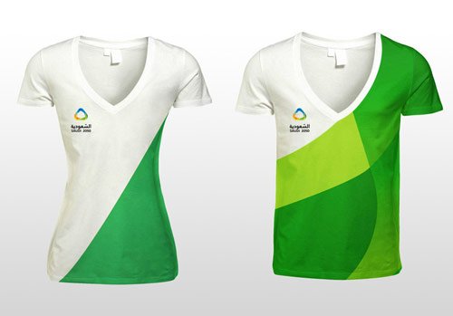
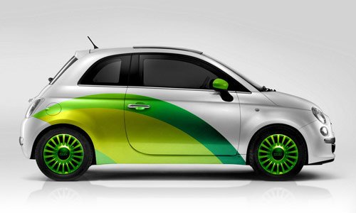
Energy Exhibition Event
The objective of this brand design was to communicate the possibilities of shaping the future through technical innovation in energy conservation and it’s targeting youth.
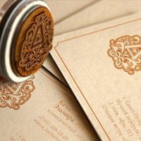
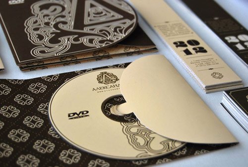
Alexandrite. House of Russian Traditions
Logo design and corporate identity for the Russian club “Alexandrite“. The mark used is very diverse, as a separate brand unique monogram and a solid mark in the form of a certain composition


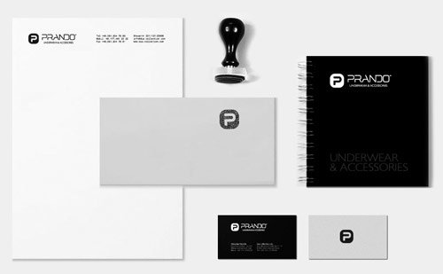
Prando. Underwear & Accessories
Cool branding design with minimal style. Prando specialize in selling men’s and women’s underwear, baby clothes range, home clothing, swimwear, hosiery and accessories.

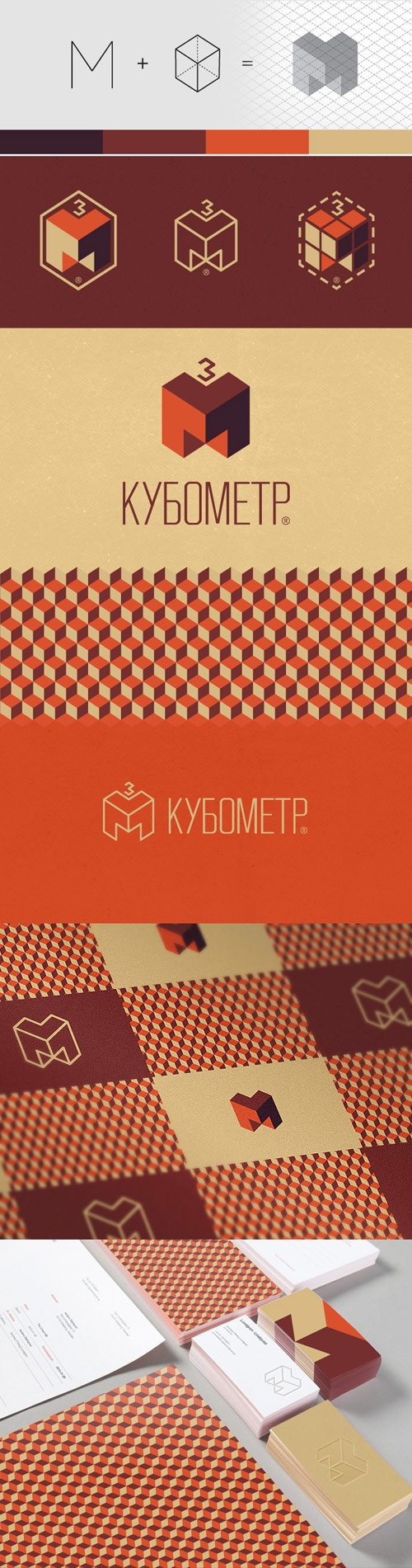
Cubic Meter
Great branding and identity design concept by combining letter “M” and “cube”.
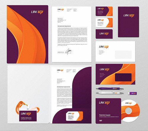
Link UP
Bright and dynamic branding for a Ukraine based hosting company, Donetsk. The company provides hosting services.

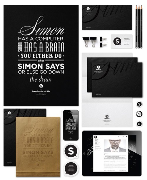
Simon Says – Corporate Identity 2012
Simon Says project’s main focus is to make visual identities, build brands, coordinate and manage design and production processes.

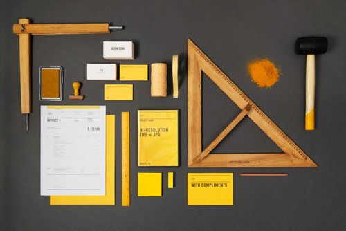
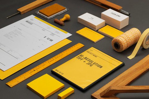
ACRE
Studio Identity & Collaterals for ACRE with perfect presentation.
Visual Identity for Studio Vii
This project presents the development of visual identity for the Studio Vii- a design studio, designed by the authors.

Noeeko – Identity
Noeeko is the working name of freelance Art director and Graphic designer Michal Sycz. Open to any form of expression, Michal combines photo manipulations, vectors, hand drawn elements, and 3D shapes.

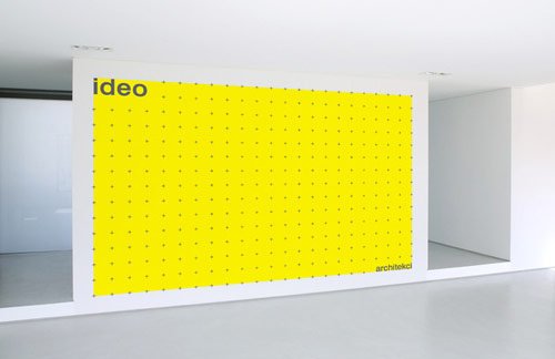
Ideo Architekci
Branding of ‘ideo architekci’ studio from Wroclaw / POLAND. The idea behind the logo is ‘maximum of flexibility’ & adjustable logo size and shape based on the ‘Cross Grid’ system. The basic logo shape expands on different media. The logo becomes a living form, filling out the space & adjusting itself to the ID area.

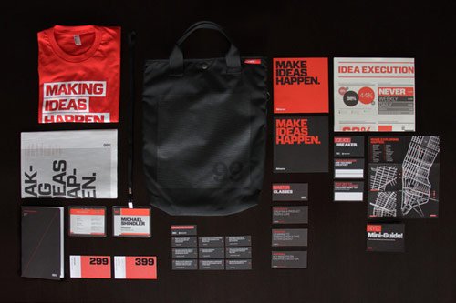
99% Conference 2012: Identity & Branded Materials
All of the 99% Conference materials get re-imagined and re-designed by the Behance Team every year, and 2012 was no different.
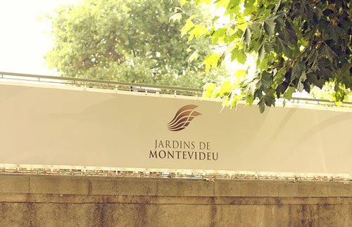
Montevideu – Vila Montevideu & Jardins Montevideu
This identity blends the initials “V” from Villa and “J” from “jardins” (which stands for gardens) with these last mentioned elements from the ocean and the gardens, to turn these brands more personal and maintain a certain coherence between the space where the buildings are, and their own identity.
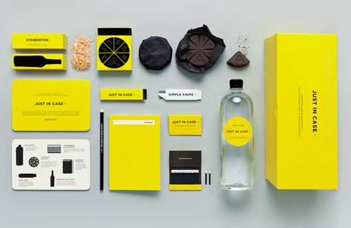
Just In Case
MENOSUNOCEROUNO created JUST IN CASE ®, the perfect brand for the end of times. A brand that covers all your basic apocalyptic needs.


ABOVE & BELOW – Branding for a Tree Museum
The brand itself has a unique colour palette that changes with the seasons, reflecting the colours of tree foliage. Campaign material changes every three months – this keeps the brand fresh and seasonal.

LingoGlobe
Another great example of branding design. The scope of our work included the graphic creation of corporate identity, icons and website.


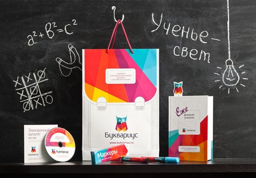
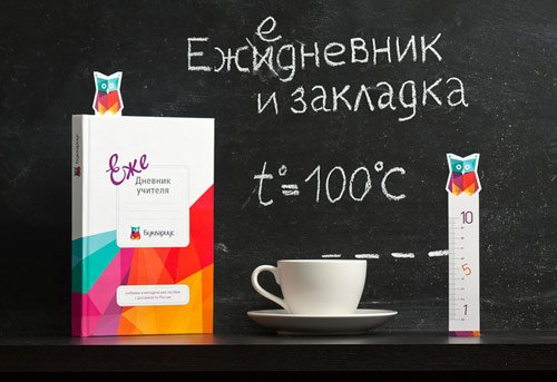
Bukvarius
Amazing identity design that turn the brand into an integral part of school life, an active participant of the learning process. Every element of visual identity combines learning and playing: paper bags are stylized as school bags, the presentation folder with the brand character on it reminds of drawing lessons, and humorous mnemonic rules on pocket calendars help one to learn rules better.
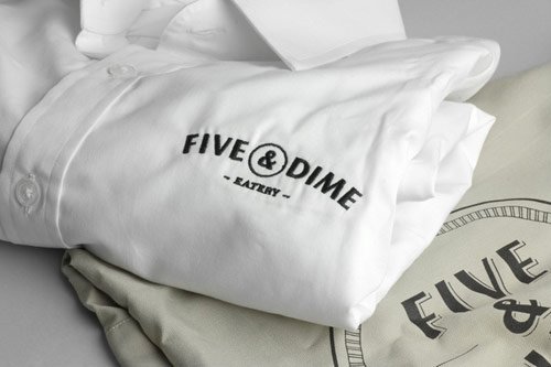
Five & Dime
Branding design for a restaurant/cafe in Singapore. A coin is used as a visual representation of the name. Five & Dime refers to a variety store where everything is sold for 5 or 10 cents.

Opera
Inspired by luxury brand logos, the old logo is replaced with a slick elegant “O” symbol and a classy new handcrafted typeface for the wordmark. The opulent and colourful visual language is made from a variety of rich fabric textures placed together in classical yet modern floral pattern. The mother brand remains gold, ivory, white and black emphasizing the Luxury element in the brand.
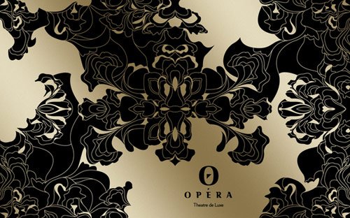

Image Credits: